The example I’m running through is available at http://sdrv.ms/11lH3KR
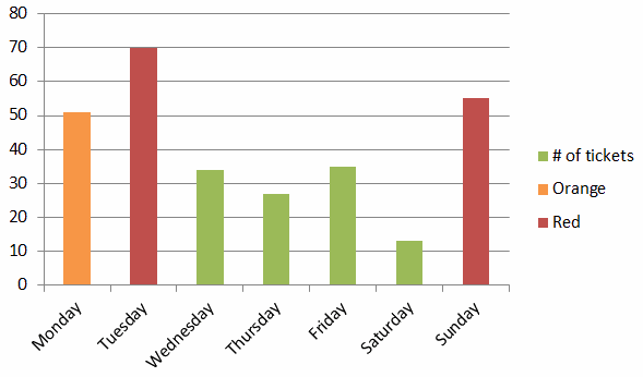
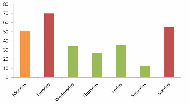
The scenario we’re looking at is where we want to be able to convey quality within a chart by having differently coloured columns, based on different conditions that we want to specify. Unfortunately, the ability to natively apply conditional formatting isn’t yet present, but we can mimic it by overlaying series of the same size that are coloured differently.
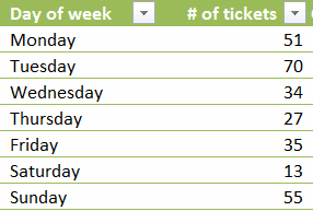
First thing you need is your data:
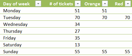
Then you need to add columns with formula that are of the structure =if(condition to meet, number, “”)
So…
where Orange = IF([@[‘# of tickets]]>=AVERAGE([‘# of tickets]),[@[‘# of tickets]],””)
and Red = IF([@[‘# of tickets]]>=PERCENTILE([‘# of tickets],0.75),[@[‘# of tickets]],””)
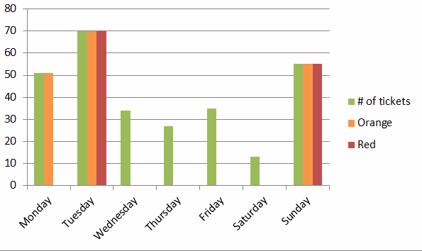
You can now make a column chart and colour the series as required. Make sure the series go from left to right in increasing priority. Change any orders on the ‘Select Data’ menu using the up and down arrows.
Once done, format a series and set overlap to 100%, and the job is done!
Of course you can tidy it up a bit further
